Why won't my WPF app use Windows 11 styles?
Update January 2025 - The new Windows 11 themes in WPF are out! See here for how to enable them. Note that there are various bugs with them at the moment, so it might not be a good idea to use them in a production environment. Some bugs have been fixed in .NET 9.0.1.
Update November 2024 - .NET 9 should be released soon with new themes for Windows 11. More info here.
Update July 2024 - Microsoft has uploaded a WPF Gallery Preview app to the Microsoft Store which shows the new Windows 11 styles for WPF which are currently being worked on.
Update 3/12/2023: Microsoft has outlined the scope of adding Windows 11 themes to WPF, you can see it on GitHub here. Additionally, the scope mentions dark mode so this is good news if you want to support dark mode in your app here. See the latest update from Microsoft on WPF's GitHub repo here.
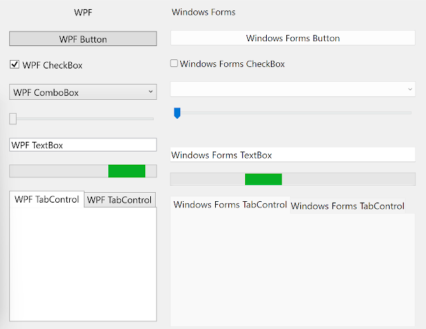
If you've used Windows 11, you may have noticed that WPF apps still look like they did on Windows 10 and don't use Windows 11/system visual styles - controls use the same colours as they did on Windows 10 and don't have Windows 11 style rounded corners (aside from top level windows) and don't look any different than they did on Windows 10. Meanwhile, in Windows Forms apps, most of the controls do look updated.
Tip: If the issue you're having is with some controls such as MessageBoxes and WindowsFormsHosts not using visual styles - so looking like they're running on very old versions of Windows like Windows 95 - read this article here.
 |
| WPF controls compared to Windows Forms controls on Windows 11 |
Why this happens
To understand why this happens, we first have to understand how visual styles work in Windows. Visual styles was a feature initially released in Windows XP and allowed for much better looking controls that could contain more than just solid colours and could be customisable by the user. In Windows XP, users could choose between the Blue, Silver and Olive visual styles or could choose to disable visual styles and have controls appear as they did in previous versions of Windows. Microsoft also provided additional visual styles such as the Media Center and Zune styles. These visual styles are stored as images in 'C:\Windows\Resources' as .msstyles files and are used by the GDI (Graphics Driver Interface) based common controls and many Windows Forms controls. WPF came out in 2006 as part of .Net Framework 3.0 and was originally known as 'Avalon', which you may have heard of from Windows Longhorn. Windows Vista, which comes preinstalled with .Net Framework 3.0, also come out in 2006. Windows Vista included a new visual style to replace the Windows XP ones but still used the same visual style system (though Windows Vista introduced the Desktop Window Manager (DWM), which can be used instead of GDI to render parts of windows such as title bars, and does not use the same visual styles that traditional GDI based versions of these parts use), however, a new visual style system was introduced with WPF with separately defined visual styles that are vector based as opposed to using prerendered raster images - this allows the controls to scale better to different screen resolutions and DPI (Dots Per Inch) scaling settings (Tip: If you have issues where your WPF UIs appear blurry, read this article). WPF's visual styles are stored in various DLL files included with the .Net Framework, for example, the Windows Vista/7 visual styles are stored in PresentationFramework.Aero.dll and the Windows XP blue style is stored in PresentationFramework.Luna.dll. Since WPF is compatible with Windows XP, all the in-built visual styles in Windows XP were recreated with vector graphics in WPF - you might even notice this if you have seen both a WPF button and a Windows Forms button for example in Windows XP with high DPI settings - the WPF button will look smoother than the Windows Forms one, as shown in the screenshot below: |
| A screenshot of a WPF and Windows Forms Button using the Windows XP silver style. Notice how much smoother the WPF one looks since it is using vector graphics, rather than a stretched image. |
Extra: WPF and Windows Forms UIs look very similar when using the Windows classic/standard/high contrast themes (i.e. themes that don't use visual styles) because, when using these themes, the colours are provided as part of the theme (no images are used, just basic colour values) and both Windows Forms and WPF use these same colours. When using themes with visual styles, colours provided with the theme itself are only used in some places, other places use mostly images (for Windows Forms) provided with Windows or vector graphics (for WPF) provided with the .Net Framework.
Where we are today
These days, the original visual style system introduced in Windows XP is still used, and so is WPF's. Microsoft has also introduced newer UI frameworks with their own visual style systems such as UWP and WinUI. Microsoft is currently in the process of updating the WPF visual styles to include visual styles for Windows 11, but it is not released yet. In fact, the last visual styles in WPF were for Windows 8, and these same visual styles are used on Windows 10 and 11, hence making WPF user interfaces look quite dated by default. Microsoft has only added new Windows 11 visual styles for WinUI and for the original visual style system introduced in Windows XP - hence why WinUI, GDI and Windows Forms user interfaces look more up to date on Windows 11.What can be done about it
- Overview of porting from .NET Framework to .NET
- Breaking changes for migration from .NET Framework to .NET Core
- .NET Framework technologies unavailable on .NET
- .NET application publishing overview
- Packaging a .NET Core 3.0 application with MSIX
How you can help
- Vote on the Windows 11 Theming option here.
- Support the WPF GitHub repository here.
- Support and contribute to this, this, this, this, this, this, this, this, this, this, this and this issue on the WPF GitHub repository. These are all issues in relation to modernising the appearance and behaviour of WPF.
- Keep an eye on the .Net blog to keep up with the latest improvements in WPF.
- Use 3rd party libraries that provide visual styles that better match Windows 11
- Use modern icons to make your WPF UI look more modern
- Enable shadows and rounded corners on ToolTips in Windows 11
- Disable various compatibility features on your WebBrowser controls to make it behave more modern and support more modern web features
- Enable per monitor DPI scaling to make your WPF UI look more clear
- Enable a better touch screen scrolling experience
- Enable precision scrolling
- Enable dark mode support for your app's title bar
- Enable better looking and easier to see WPF text selection visuals
- Use a modern file open picker in WPF
Summary
So to summarise, the reason WPF controls still look the same as they did in Windows 10 whereas many Windows Forms controls used updated Windows 11 styles is because WPF and Windows Forms get their visual styles from different places, and the visual styles WPF uses haven't been updated for Windows 11, whereas the visual styles Windows Forms uses has. Luckily, Microsoft is working on updated visual styles for WPF, including dark mode support, so hopefully WPF gets Windows 11 visual styles in the near future.
Did this guide help you? Do you have anything to add? Do you know or do you work on/have created any libraries that bring more modern visual styles to WPF? Let us know in the comments! Also, if this guide did help you and you use an AdBlocker and you want to support us, consider disabling it for this site - if you do, it will be greatly appreciated!


Comments
Post a Comment